 |
Now that a user's graph of their link-space is established, the next step involves placing several graphs side-by-side and connecting them where
there is interesting overlap.
Overlap in the context of these experiments consists of sharing a user between the graphs (the column count/number of users is configurable),
although one could also map the connections between the actual individual links themselves.
|
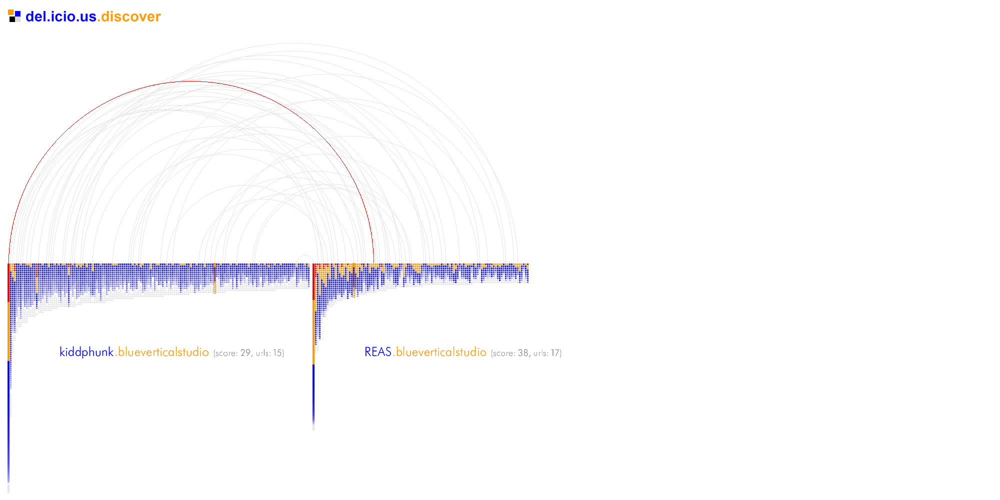
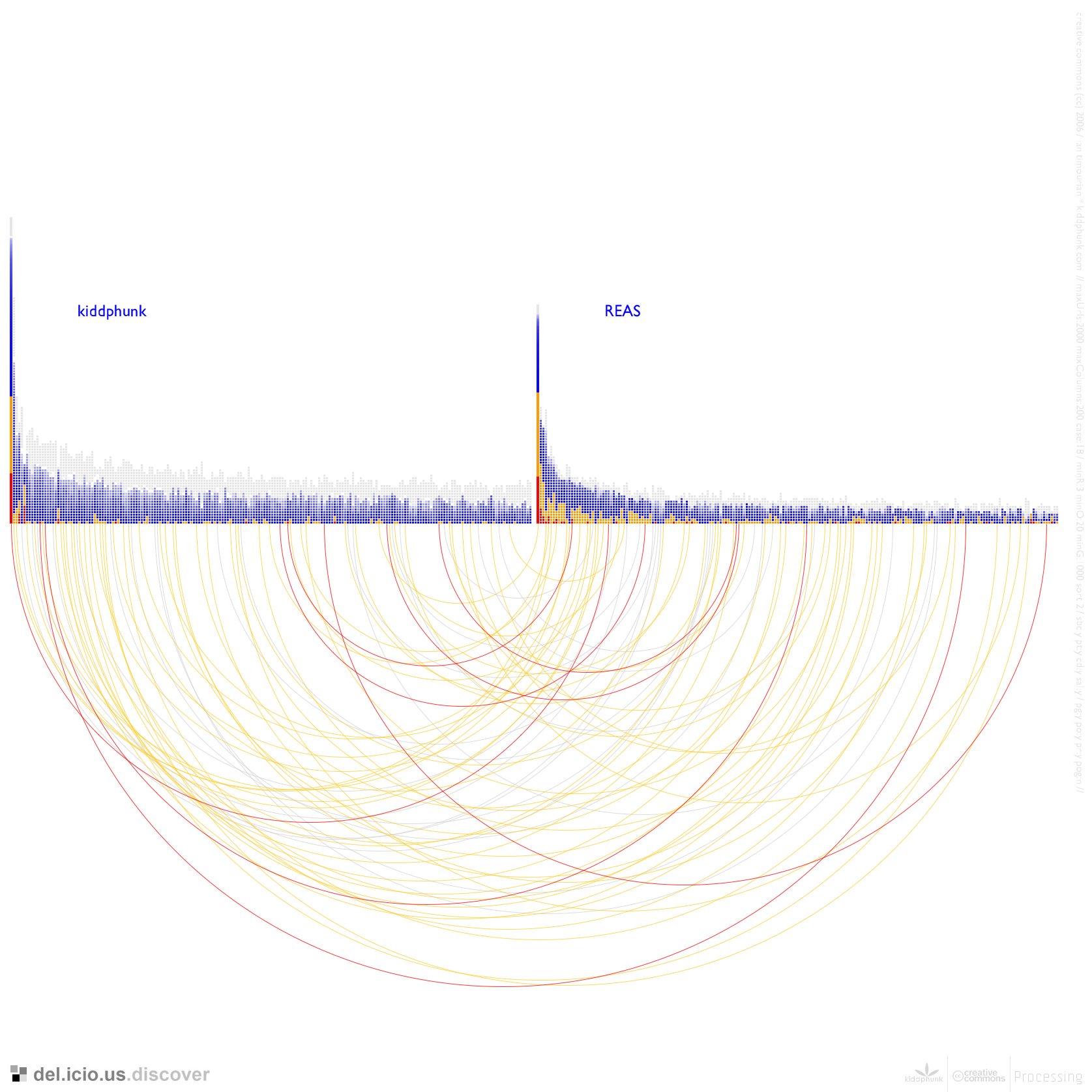
Originally del.icio.us.discover was an interactive application that displayed several graphs and highlighted users (columns of the graph) that
were shared. As you moused-over a column the name of that particular user was shown and was highlighted in orange in all graphs containing that
user.
Figure 03.02 above shows this behavior, highlighting the user blueverticalstudio who is common to both REAS and kiddphunk.
'Score' refers to the 1-4 point weighing score discussed in the previous section, and 'urls' to the total intersecting links.
|
I decided to produce a set of images rather than a true interactive application due to the tradeoff of memory and speed/optimization in the
app. The amount of data and processing involved also prohibited doing this with real-time data from del.icio.us, and so I decided on using
a sample set of users and pre-gathering the data required to generate their graphs.
|
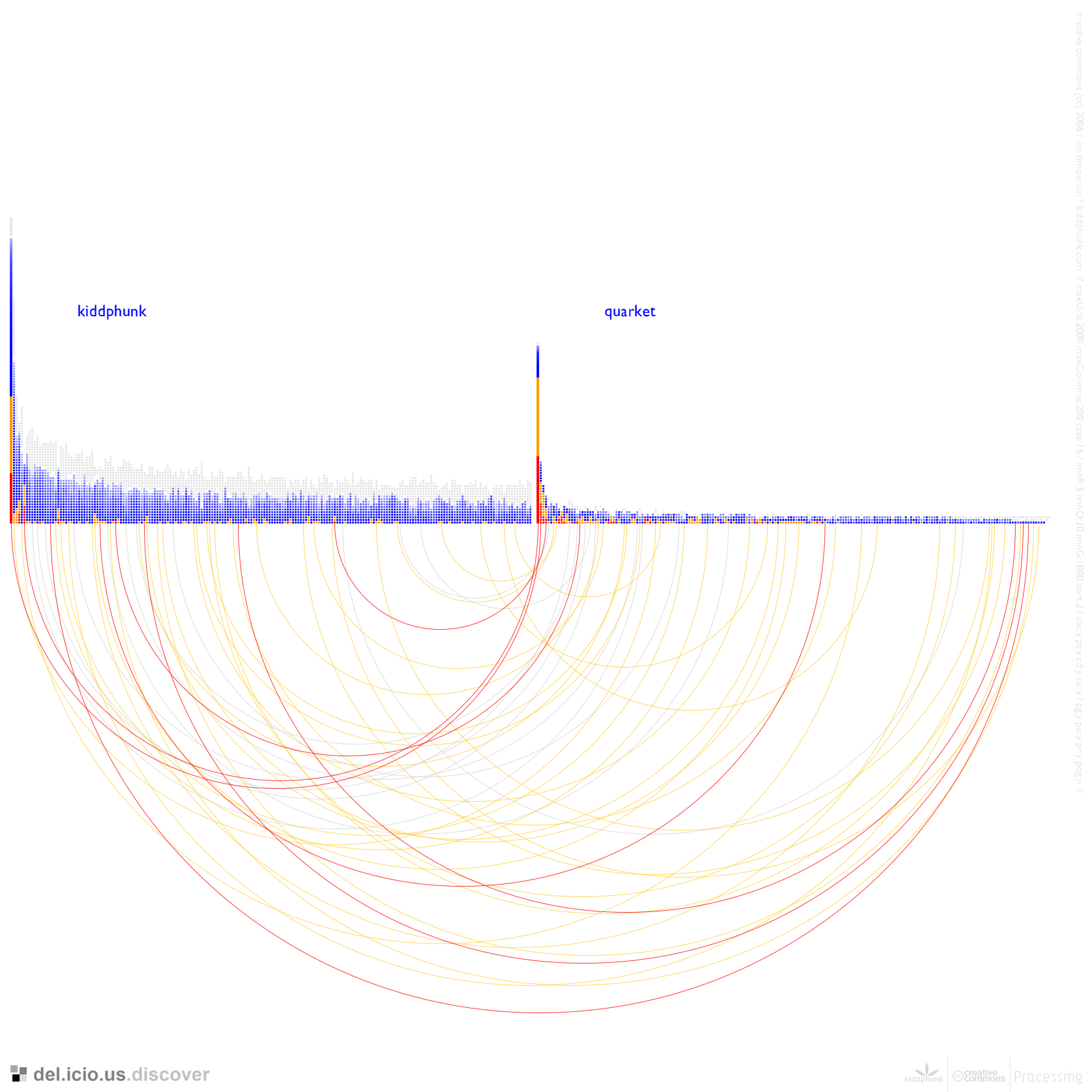
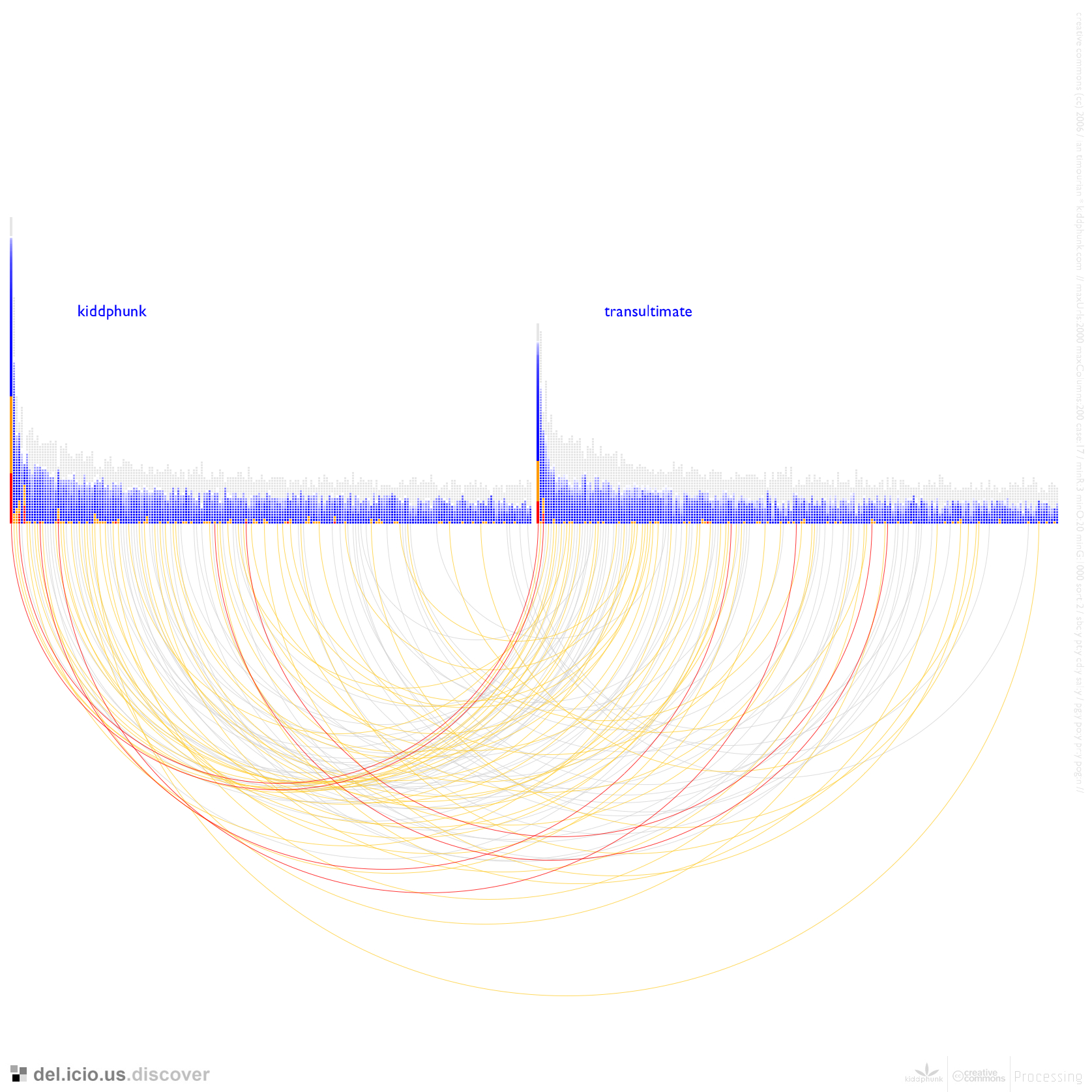
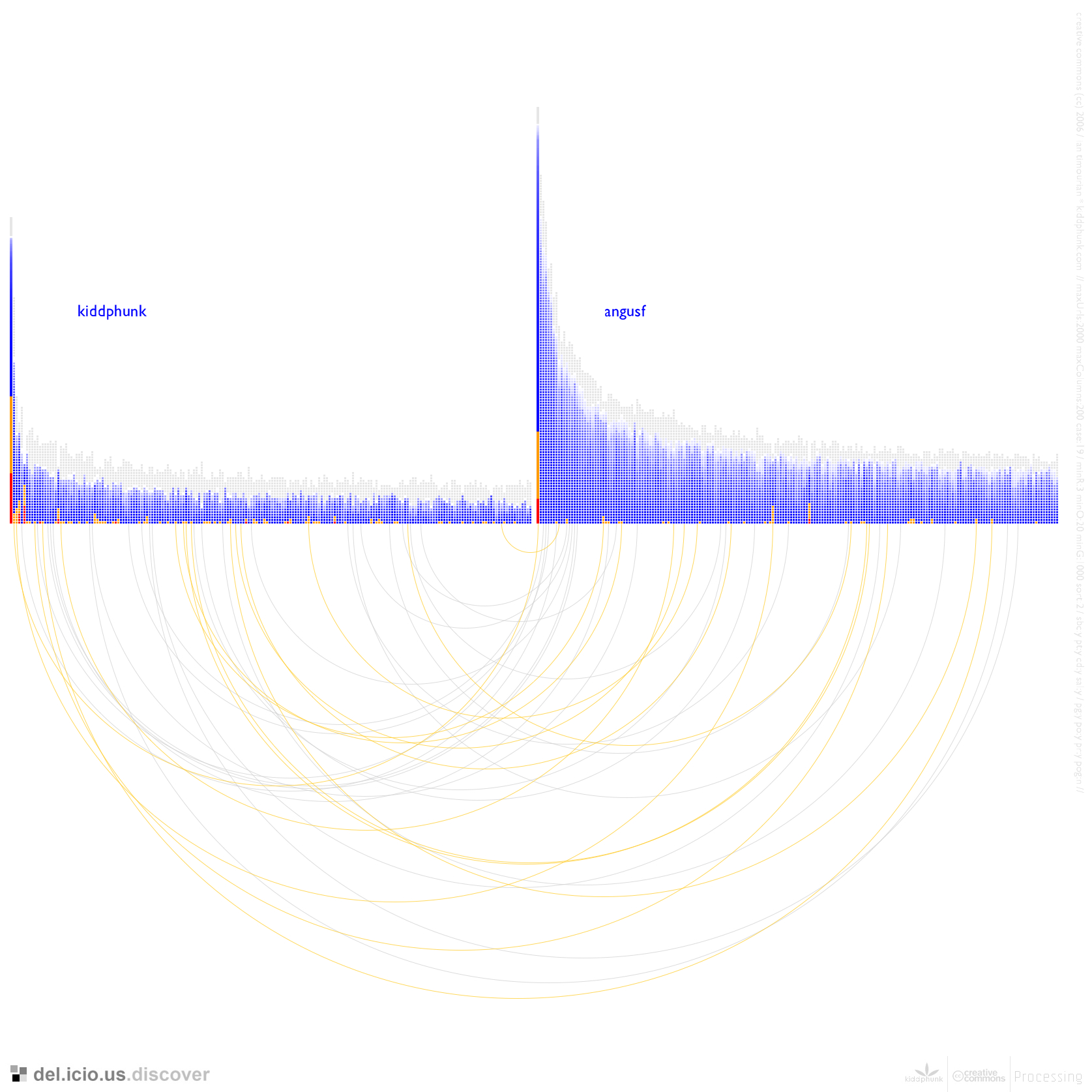
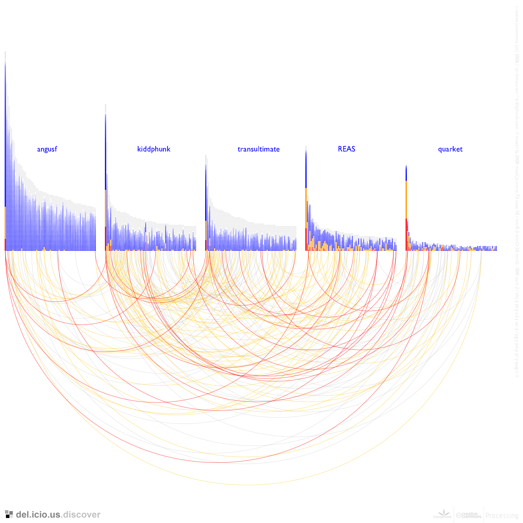
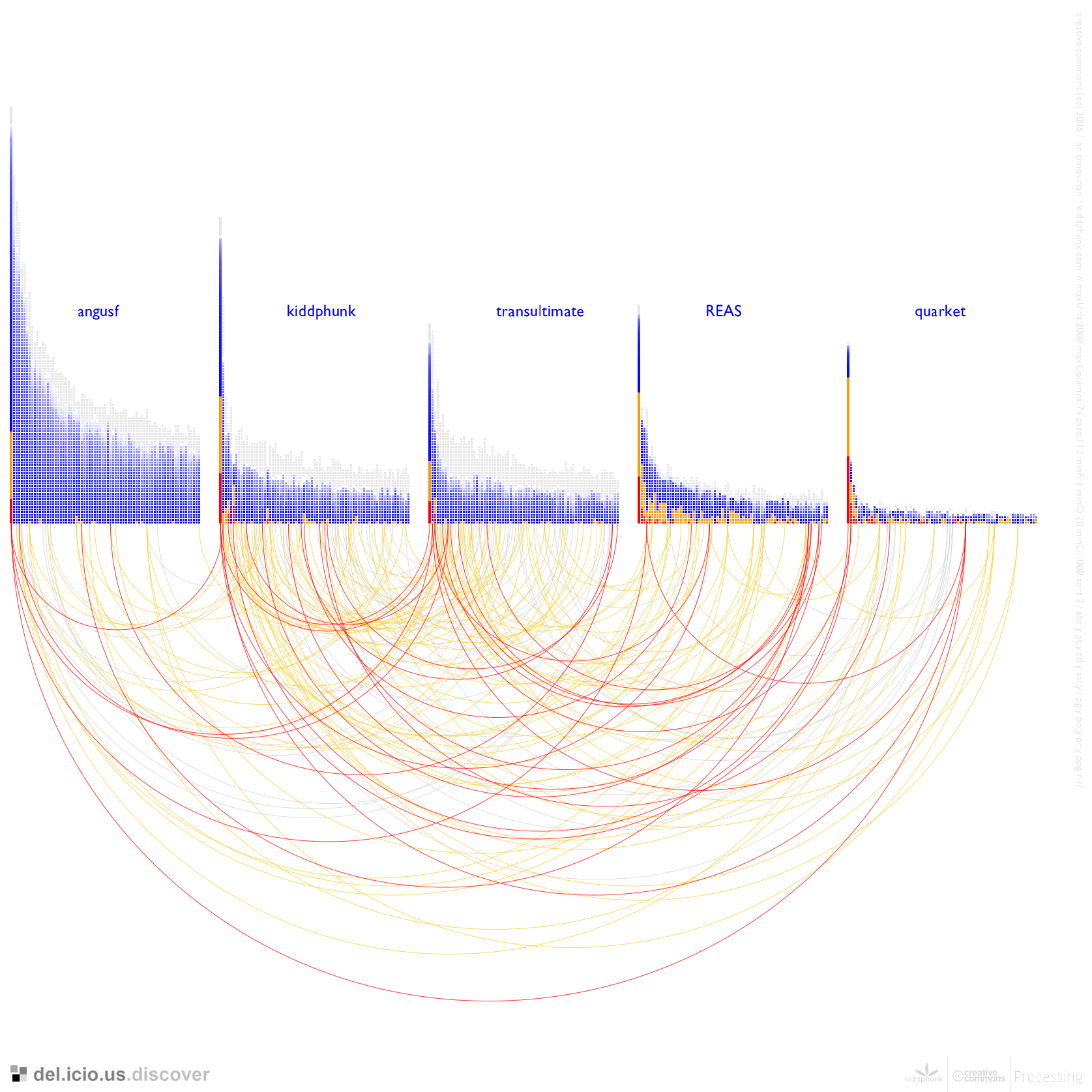
Two users in the examples, quarket and transultimate, are close friends of mine with whom I love to bounce ideas and information
off of. As we have many similar interests and due to exchanging of links via {IM, irc, email, mailing lists}, my graph (kiddphunk) and their graphs display an unusually high correlation between our respective link-spaces.
Another user REAS is a friend-of-(multiple)-friends and the remaining users (to my knowledge) I did not know a priori, and selected them basically
at random from the set of my intersecting users that looked 'interesting'.
The four individual panels of Figure 03.03 show pairs of graphs connected, between {kiddphunk} and {quarket, transultimate, angusf, REAS}.
|
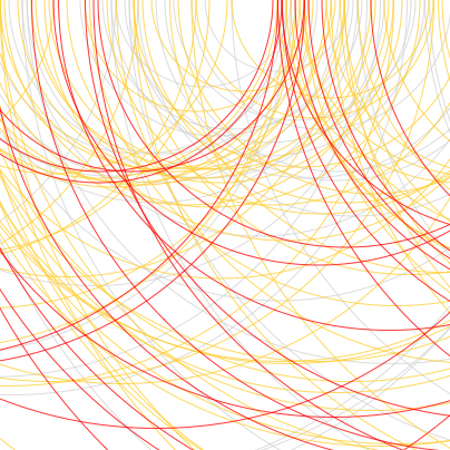
Two columns are linked by an arc if they represent the same "sub-user" in both graphs. The color chosen for these renderings was red, orange and grey depending on
the presence of them in the leftmost (of the pair) graph's user column. That is the colors sort of show a 'leftward' flow or a little bit of information about how
the subuser existed in the left graph. I could easily have flipped the polarity or taken a max representation.
The forms of the next section, which I had already
started to envision, negated the real need to play around with these representations much further.
|
A few additional graphs in this series (as well as many others from all of the sections) is available in highest resolutions at this flickr visualization gallery.
Continue on to part 04 | Abstractions
|
 03.01
03.01
 03.02
03.02
 03.04
03.04
 03.05
03.05