| 01 | | | INTRO |
| 02 | | | GRAPHS |
| 03 | | | CONNECTIONS |
| 04 | | | ABSTRACTIONS |
| 05 | | | RECOMMENDATIONS |
| 06 | | | OUTTRO |
| 00 | » | beatspixelscodelife.com |
 02.01
02.01
 02.02
02.02
 02.03
02.03
 02.04
02.04
 02.05
02.05
The graphs in this set of experiments/visualizations are tag-agnostic; tags on any link are not taken into account, although one could easily imagine various ways to integrate tag pruning/filtering/matching to assist in searching, or setting the seed directions for an 'information stroll'.
Every hugely popular link started with one posting and a new link that has 1 person considering it important may have 1000 people within a week. Due to the nature of the link-space and the curves that fall out of it, the temporal aspect of these graphs is not of great concern, although there are many interesting predictive ideas to explore.
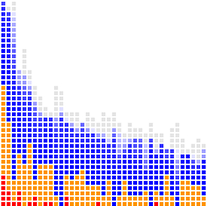
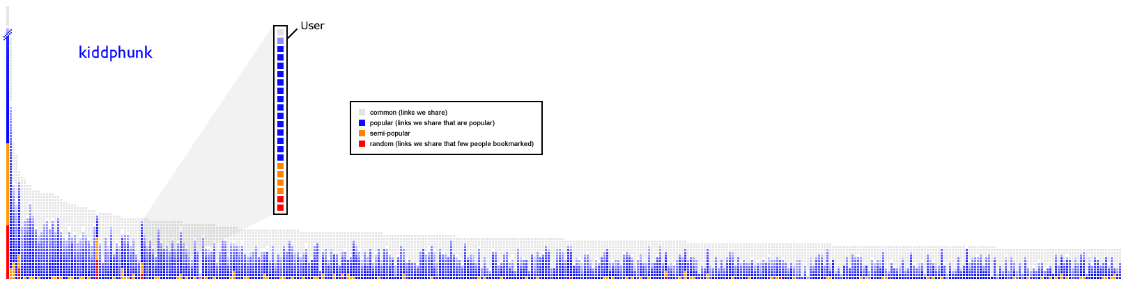
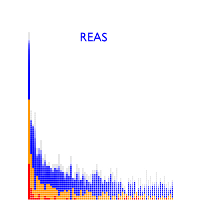
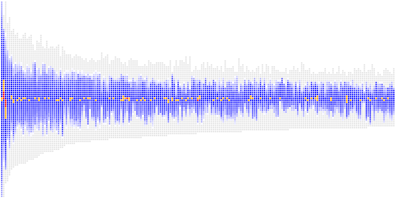
Each column of colored squares represents a different del.icio.us user. The 10 pixel x 10 pixel squares that form the body of the columns each represent a particular link from that user's link-space that had intersected my link-space. The leftmost column with the solid bar is a stack of my links, with the height of each square compressed down to 1 pixel to save space.
I can now sort by total number of links matched and graph in descending order. This creates a characteristic power-law distribution curve that will be discussed in greater depth shortly.
common = grey = (P > 1000)
popular = blue = (20 < P <= 1000)
semi-popular = orange = (3 < P <= 20)
random = red = (P <= 3)
The link squares are now colored to match popularity and within each column are further sorted with the most popular links at the top in grey, followed by a gradiented blue representing the "middle ground", then the more random (less-popular) links at the bottom in orange and finally red.
One optimization that I did not have time to implement were sorting modes that found users with higher internal red/orange matching percentages by considering the total number of links in an individual's link-space.
"What matters is this: Diversity plus freedom of choice creates inequality, and the greater the diversity, the more extreme the inequality... The very act of choosing, spread widely enough and freely enough, creates a power law distribution."
(Excerpt from Power Laws, Weblogs, and Inequality,
see also Wikipedia Scale-free networks for more background information on social networks and the power law distribution.)
So a rather small sampling of users taken in the form of monitoring their 'link stream' or as an on-demand summary could give a fairly decent sampling of interesting links based on past link history, assuming an adequate amount of information has been accumulated.
* quarket has the highest proportion of less-popular links (the orange) than REAS, who in turn has a higher orange proportion than kiddphunk.
* while quarket and REAS have roughly the same number of book-marks in their respective link-spaces and a very roughly similar amount of less-popular links, quarket overall has much less area under the curve, implying that many of the less-popular links were not shared with anyone else or are very widely distributed across a wider range of users.
Continue on to part 03 | Connections